
The 1975 production of “Something to Hide” had something new to show: a brand new logo for SBADS.
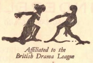
The rather worn logo of the British Drama League
The logo was prompted by a change of printers: in those days, SBADS posters were typeset by the printing company using moveable type – individual letters made out of metal or wood – and there was very little opportunity to include images apart from a few small stock blocks, which were the origin of ‘clip art’. One logo had appeared regularly before, being the logo of the British Drama League: and a very odd logo it was, taking the vague – and badly worn – forms of two figures in some sort of dramatic pose.
The switch to a different printer spurred a call for a new motif for the company. The call went out for ideas, and many were submitted.
The winning motif was suggested by Alan Prince, who had appeared on stage with the society for the first time that year.
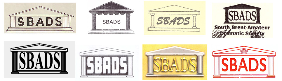
The original SBADS logo as suggested by Alan Prince in 1975.
Alan’s concept of the SBADS acronym flanked by a ‘proscenium arch’ of Doric columns under a pediment appears unchanged from that date to 1991, reflecting a world in which the professional printer kept tight control over the printed image. The logo was made as a printing block, which had to be given to the printer each time a poster was commissioned. It could only appear in its original size.
From the 1990s, the brave new world of desktop publishing began to intrude on the printer’s art: now anyone with access to a photocopier or even – what wonder! – a computer could create a design and reproduce it as many times as they pleased. Alan’s logo still survived, but it was joined by new variants drawn up on new equipment, or even by hand. Some, it is fair to say, were more successful than others.
It’s perhaps hard to understand now that using a logo in 1991 was remarkably difficult: even big companies struggled to be consistent. Small companies were still in the hands of the commercial printer. Even professional printers were limited by the availability of digital typefaces, which were still in their infancy: the first casualty for SBADS was the distinctive lettering. The original SBADS letters had been chosen simply because the printer had a sheet of Letraset rub-down letters in that font (Windsor Elongated, font fans, on Letraset sheet 1512); it was now replaced by a vaguely similar – but wider – Macintosh font, surrounded by more detailed columns and extra steps.
The 1991 redesign of the SBADS logo
For the amateur poster maker, adding a logo generally meant literally cutting one off an existing print and pasting it onto something new, with the possibility of making it smaller or larger only by using a photocopier. Even if you had access to a computer, you probably didn’t have access to a wildly expensive ‘digitiser’ (scanner) to create digital copies of existing logos. If you needed a logo that you could use on a computer, it was easier just to create a new version.
And thus began a free-for-all that lasted for three decades. Sometimes the new version ‘official’ appeared, sometimes the original. If a SBADS volunteer braved the new world of the computer it was not uncommon for a completely new image to appear that might – or might not – look something like the logo. Sometimes the logo disappeared altogether. Alan Prince’s hand-drawn original continued to pop up as late as 2015, competing with whizzy 3D computer-generated versions.
It’s a logo, Jim, but not as we know it…
Sadly, the modern world demands a little more uniformity, and a little more clarity. The fine lines of a hand-drawn logo designed for ink printing on posters nearly 50 years ago now battle the tiny pixels of a hand-held smartphone, while its proportions need to fit predetermined spaces online. An updated – and we hope lasting – version of the SBADS logo has been redrawn.
Restoring the original lettering surrounded by a familiar, but simplified, proscenium, redrawn to scale perfectly down to a tiny size, the modern SBADS logo brings nearly 50 years of fiddling to a close. Possibly…
A new version of an old classic – the 2025 version of the SBADS logo